2023-08-18 00:00:00
4 min read
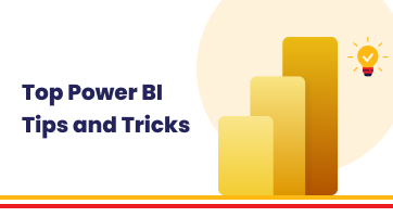
In the world of data visualization, Tableau stands out as a super useful tool. It helps us make sense of complicated data by turning it into easy-to-understand pictures and graphs. Whether you're just starting with Tableau or you already know your way around, this blog is here to help. We've put together seven really cool tips and tricks that will make you even better at using Tableau. It's like discovering secret paths to make your Tableau projects more amazing. So, get ready to learn and improve, whether you're a beginner or already really good with Tableau!
#TIP 1: Using Dynamic Titles and Captions in Tableau
Imagine you're working on a sales dashboard in Tableau, showing the performance of products across different regions. Now, with dynamic titles and captions, you can take your dashboard to the next level. Let's say you've created a parameter that allows users to select a specific region.
By using this parameter in a calculated field, you can make the title of your dashboard change according to the region chosen. For instance, if a user picks "West," the title can automatically become "Sales Performance in the West Region." This not only adds a personal touch but also helps users quickly understand what they're looking at.
Additionally, you can use dynamic captions to provide extra context. If you're displaying a line chart showing the growth of sales over time, the caption could adjust itself to show the period being displayed. This way, users always know exactly what they're seeing without confusion. Dynamic titles and captions might sound complex, but they're like magic tricks that make your dashboard super user-friendly and informative!
#TIP 2: Adding LOD Expressions in Tableau
These expressions play a pivotal role in conducting intricate calculations that may otherwise prove challenging. LOD expressions are like specialized tools that enable us to solve complex problems within our data.
For instance, consider a scenario where you're analyzing sales data across various products and regions. You're interested in calculating the percentage of total sales that each product contributes, irrespective of the filters applied by users. LOD expressions come to the rescue by allowing you to craft calculations that disregard specific filters, facilitating a comprehensive analysis.
Imagine a dataset encompassing sales figures for different product categories across diverse regions and time frames. You aspire to determine the proportion of sales each category constitutes in relation to the overall sales, irrespective of the selected region or date range.
Through the application of LOD expressions, you can accomplish this task seamlessly. By employing the FIXED LOD function, you can compute the total sales across all categories. Subsequently, dividing the sales of each category by this aggregated total yields the desired percentage. Furthermore, LOD expressions encompass distinct categories such as FIXED, INCLUDE, and EXCLUDE, each catering to unique analytical requirements.
Let's dive into practical examples of LOD expressions to provide a clearer understanding of their application.
1. Using FIXED LOD for Consistent Aggregation:
Let's say you're analyzing a sales dataset with categories and subcategories. You want to calculate the average sales per subcategory, regardless of any filters applied. FIXED LOD expressions allow you to do this by creating a calculation that fixes the aggregation at a certain level.
For instance, you can use the following calculation to calculate the average sales per subcategory, regardless of filters:
{FIXED [Subcategory]: AVG([Sales])}
This ensures that the average sales calculation remains consistent even if other filters are changed.
2. Leveraging INCLUDE LOD for Customized Aggregation:
Consider a scenario where you're analyzing customer data and want to calculate the total profit for each customer segment. However, you also want to ensure that the calculation adjusts to any filters that users apply. This is where INCLUDE LOD expressions come into play.
For example, you can use the following calculation to achieve this:
{INCLUDE [Customer Segment]: SUM([Profit])}
This calculation computes the sum of profit for each customer segment while considering the active filters, providing tailored insights.
3. Using EXCLUDE LOD for Comparative Analysis:
Imagine you're working with a dataset that contains information about products, and you want to compare the sales of each product to the average sales of all other products. EXCLUDE LOD expressions allow you to exclude certain dimensions from the aggregation.
To accomplish this, you can use the following calculation:
{EXCLUDE [Product]: SUM([Sales])} / {EXCLUDE [Product]: AVG([Sales])}
This calculation calculates the ratio of sales for each product against the average sales of all other products, offering a clear perspective on relative performance.
#TIP 3: Adding Custom Shapes and Images to your Tableau Dashboard
Adding custom shapes and images allows you to infuse a distinct identity into your visualizations, enhancing their visual appeal and reinforcing your data storytelling.
To get started, consider a scenario where you're presenting data about different office locations and their performance metrics. Instead of using standard shapes to represent each location on a map, you can incorporate custom icons that reflect the character of each office, such as a building icon for headquarters and a satellite icon for remote offices. This subtle incorporation of custom shapes not only adds a touch of authenticity but also aids in quickly identifying different locations on the map.
The process of adding custom shapes involves importing image files in formats like PNG or SVG and mapping these images to data points. For instance, if you're visualizing data about different car models and their fuel efficiency, you can use custom car icons to represent each model. By mapping these icons to the corresponding car data points, your visualization transforms into a visually striking dashboard that communicates information effectively.
#TIP 4: Creating Interactive dashboards
Interactive dashboards are more than just static displays; they enable users to explore data dynamically and extract insights on their terms.
To achieve this, consider a scenario where you're presenting a sales dashboard with various sections like product categories, regions, and time periods. By implementing filter actions, you empower users to click on a specific category or region and instantly see how it affects other parts of the dashboard. For instance, when users select a particular product category, the entire dashboard adjusts to showcase data exclusively related to that category. This level of interactivity turns your dashboard into a personalized analytical journey.
Highlight actions further enhance user comprehension. Imagine you have a map displaying store locations with sales performance. By creating a highlight action, users can simply hover over a store, and the corresponding data across other sheets on the dashboard gets highlighted, providing context and aiding in comparison.
URL actions offer a bridge to external resources, enabling seamless navigation between Tableau dashboards and external websites. For instance, within a dashboard focused on global economic indicators, you can embed URL actions to allow users to access detailed reports, articles, or other relevant external content. This integration not only adds depth to your dashboard but also transforms it into a hub of valuable information.
Furthermore, setting up parameters enhances user control and the coherence of your dashboard. Parameters enable users to make selections that impact multiple sheets simultaneously. For instance, in a dashboard showcasing sales figures over time, you can introduce a parameter allowing users to select a specific year. This choice influences data displayed across various visualizations, maintaining a consistent context.
Interactive dashboard actions are a potent means to offer a personalized, exploratory experience to your users. By leveraging filter, highlight, and URL actions, as well as implementing parameters, you foster a dynamic environment that encourages deeper data investigation and a more comprehensive understanding of insights.
#TIP 5: Leveraging Advanced Mapping Techniques.
Advanced mapping techniques that propel your visualizations beyond the basics, transforming them into insightful geographical narratives. While basic map visualizations are informative, advanced techniques allow you to convey more nuanced information and uncover hidden patterns within your data.
Imagine you're working on a real estate dashboard showcasing property values across a city. By creating custom map layers, you can add additional context to your map. For example, you could overlay school district boundaries or public transportation routes on your map, providing a holistic view of factors influencing property values. This layering enhances the depth of information and enables users to make more informed decisions.
Heat maps and density plots offer another layer of sophistication. Suppose you're analyzing the distribution of customer activity in a retail context. By employing a heat map, you can highlight areas with the highest customer footfall, helping retailers strategically plan store locations. Similarly, density plots can be used to visualize the concentration of specific events or incidents across a geographical region.
#TIP 6: Optimizing the Performance of your Tableau Dashboard.
Let's now shift our focus to performance optimization, a critical aspect when dealing with extensive and intricate Tableau workbooks. As your projects grow in complexity and size, ensuring smooth and swift interactions becomes paramount. Here, we'll explore strategies that enable you to fine-tune your workbooks for optimal performance.
When dealing with sizable datasets, creating data extracts can significantly enhance speed and responsiveness. For instance, consider a sales dashboard spanning multiple years of data. By extracting and aggregating the necessary data beforehand, you reduce the time required to generate visualizations, ensuring users get quick insights without delays.
Employing data source filters is another effective strategy. Imagine you're working on a dashboard displaying regional sales data, and you only want to focus on a specific time frame. By utilizing data source filters to limit the data extraction to the desired timeframe, you not only enhance performance but also streamline the dataset, making it more manageable.
Minimizing the use of calculated fields can also contribute to better performance. While calculated fields are powerful tools, their extensive use can impact performance, particularly in large datasets. Consider optimizing calculations by utilizing calculated fields only when necessary and exploring alternatives like pre-aggregating data during extract creation.
Managing extract refresh schedules is equally important. In scenarios where the data changes infrequently, scheduling regular refreshes can ensure that the data remains up-to-date without unnecessary overhead. This practice strikes a balance between data accuracy and workbook performance.
#TIP 7: Incorporating Web Data Connectors
WDCs extend the capabilities of Tableau by allowing you to seamlessly pull data from web APIs, opening the door to a universe of dynamic insights.
To understand this better, imagine you're working on a dashboard showcasing stock market trends. By creating a custom WDC, you can connect to a financial data API and fetch real-time stock prices, ensuring your dashboard always reflects the latest market movements. This real-time integration offers an unparalleled level of accuracy and relevance to your data visualizations.
Creating a custom WDC might sound complex, but it follows a systematic process. You'll start by defining the data source in Tableau, specifying the connection details and authentication requirements. Then, you'll use JavaScript to build the WDC, specifying how data should be fetched from the web API. With the WDC in place, you can extract data in real-time, transforming it into visualizations that adapt to changing scenarios.
We hope that this blog has provided you with authoritative insights and practical guidance to enhance your Tableau development journey. By applying these tips and tricks, you can become a proficient Tableau developer and deliver exceptional data-driven solutions to your organization.
So, go ahead and unleash the power of Tableau! Dive into the world of data analysis, visualization, and insights. Explore, experiment, and create remarkable reports and dashboards that transform raw data into actionable information.
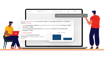
Download the Phrazor Plugin to create Narrative Insights for your Dashboards and summarize them for your business Stakeholders.
About Phrazor
Phrazor empowers business users to effortlessly access their data and derive insights in language via no-code querying